To properly display this page you need a browser with JavaScript support.
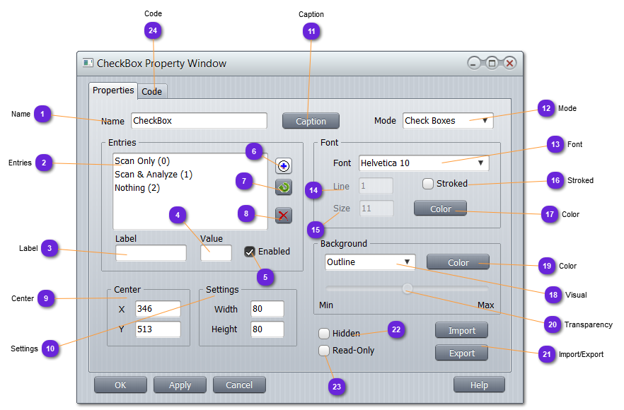
Name Name of the Check Box. Must be unique whatever its type.
vsTASKER will generate a class whose name will be <Name>_Spt . For the moment, this class will inherit from Vt_Sprite class.
Any Sprite can be accessed using its name in a generated union named s .
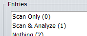
Entries List of all options or states belonging to the group.
Label Caption of the option or state either selected in the entry list or intended to be added to the list.
Value Initial value of the option or state either selected in the list or intended to be added to the list.
0 for unchecked, any other value for checked.
Enabled Initial status of the option or state either selected in the list or intended to be added to the list.
When disabled, it will appear grayed out in the group. Can be enabled from the code.
Add Append in the list the new entry line (Label, Value, Enabled).
Multiple same labels can exist in the group.
Update Replace the selected entry in the list with the (Label, Value, Enabled) updated data.
Delete Remove from the list the selected entry.
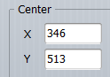
Center Coordinates, in the HMI design panel, of the box center, materialized on the design display with:
The values can be changed here for perfect precision, or using the mouse by just selecting the hook and dragging it anywhere on the HMI.
The Sprite can also be dragged while selecting any location and depressing the Ctrl key.
The Sprite can also be dragged while selecting any location and depressing the Ctrl key.
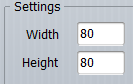
Settings Dimension of the group outline.
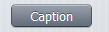
Caption Call the (optional)
Label definition window to format the text that can appear below the Switch.
Mode Select the behavior and the design of the entries (options or states ):
: list of states with only one selected (filled in black).
: list of options that can be individually selected (filled in black) or unselected (unfilled). Square box.
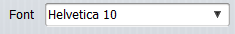
Font Select the available font.
Default OpenGL fonts use bitmaps and vsTASKER uses glutBitmapCharacter() to render them. These fonts cannot be scaled so, have to be selected carefully.
Line Width of the line drawing each character.
Size Set the size of the character, in pixels.
Stroked If options is checked, vsTASKER uses glutStrokeCharacter() routine that renders a single stroked character from a specified GLUT stroke font (Roman and Mono Roman )
Color Select here the color of the font to be used on the HMI.
Visual Select how the group box must be drawn:
: only the square shape will be drawn
: the square shape will be filled with plain color
: same as Opaque but the plain color will be transparent
Color Color used for the outline or the background color.
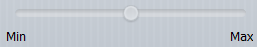
Transparency In case of a Transparent visual, use this slider to specify the amount of transparency to apply to the selected color, from (opaque) to (glass).
Import/Export Not available yet.
Hidden When checked, the group box will not be displayed at runtime. Can be set from code.
Read-Only When checked, position and size cannot be changed with the mouse.
Code
Put here all the local variables needed for this specific Slider runtime.
Initialize here (mostly in RESET part) all the variables defined in Definition section.
Default set() can also be used here for putting the Slider at a specific position between Minimum and Maximum values.
The runtime code is called every time an option or state is changed by the mouse.
For the Radio Button mode, use the following function to retrieve the selection radio button (state) engaged:
int radio_id = getRadio();
If returned value is -1 , none is depressed (might happen)
If returned value is -2 , the Check Box is not in the Radio Button mode.
For the Check Button mode, use the following code to check the value of each options:
for (int i=0; i<nb(); i++) {
int check_value = getBox(i);
...
returned value is either 0 (unchecked) or 1 (checked).

